

How We Revitalized Pine Crest’s Exterior With Just Colour

Impact Consumer Retail Experience Through Evocative Use of Colour
Ever paused to wonder how you actually “see” in colour or why everyone warns about the toll of blue light on your eyes? Probably not. But peeling back the curtain on colour vision reveals fascinating insights into how we’ve evolved to make sense of the world around us.
Pinetown, just outside Durban, has always been a place of passage; first as a 19th-century stopover on the route inland, and now as a busy node of everyday life. Over time, the town has grown into an important commercial centre, where shopping areas and small districts serve as both practical destinations and social spaces. These environments are layered with movement, signage, and colour; elements that shape how people experience and navigate retail spaces.
Retail Relevance
Significant investment is directed to ensuring property remains both appealing and relevant to current consumer needs. Beyond routine upkeep, repainting offers a chance to reimagine a building’s presence. With nothing more than a shift in colour, a familiar structure can take on renewed character; refreshing its identity and transforming how it meets the street, without the need for major investment. Pine Crest, one of Pinetown’s biggest shopping centres, recently repainted their exterior to achieve just that.
Bringing Inside Out
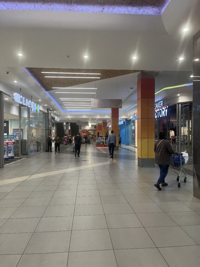
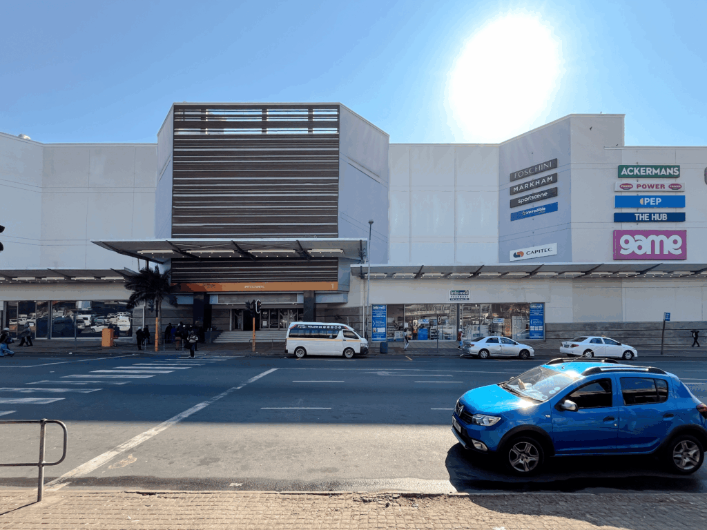
Pine Crest is still Pinetown’s biggest retail centre boasting 43 800 GLA which makes it a dominant fixture in the cityscape. Vukile, a leading South African REIT and our client on this project, sought to give the exterior a facelift to bring the vibrancy from the interior refurbishment to the façade. Avoiding delays that could cause extended operational interruptions was vital, which we prioritized through our remote contractor coordination support during the refurbishment.
Psychology Of Colour
Let’s explore why colour plays a pivotal role in retail and in life. Understanding the psychology of colour, how three simple wavelengths give rise to millions of hues and potent emotional cues, offers powerful tools for anyone interested in human behaviour. Harnessing these insights, we can craft environments and experiences that resonate more deeply with our innate and learned colour associations.
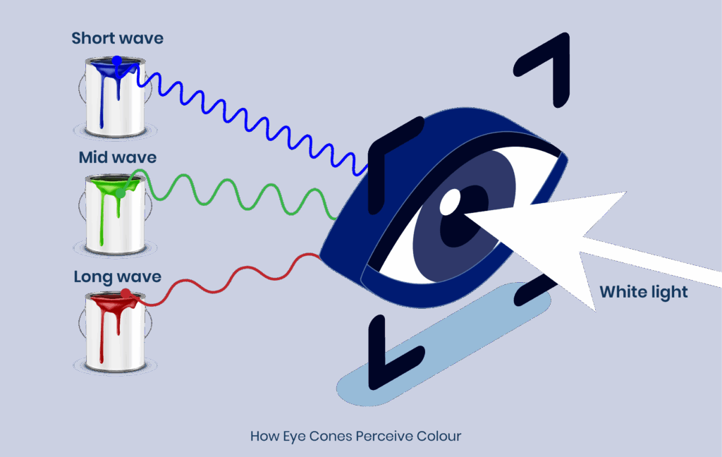
At the risk of over simplifying, our colour vision is a result of three types of photoreceptors, light sensitive cells in our eyes, that respond to different wavelengths of sunlight:
• Short-wave (blue)
• Mid-wave (green)
• Long-wave (red)
Although each cell type is sensitive to a narrow band of the spectrum, our brains ingeniously combine their signals to produce the vast array of hues we perceive each day. In other words, every colour you see is a neural interpretation built from just these three channels of information.
From Perception to Emotion

But colour vision is more than a biological trick, it’s also a canvas for emotion and meaning. From cultural traditions and brand identities to traffic signals and safety warnings, we learn to attach significance to specific colours. Over time, these associations become so deeply ingrained that they shape our subconscious reactions.
Imagine you’re speeding toward an intersection at 140 km/h at night (we wouldn’t recommend you actually try this). As the traffic light turns red just before you arrive, your conscious mind registers “stop,” but your body reacts instantly: your heart rate spikes, your palms sweat, and a wave of anxiety washes over you. In that split second, the colour red does more than convey information, it triggers an instinctive emotional response rooted in both physiology and learned meaning.

A Systematic Take on Colour
To put some order around these associations, Andrew Elliot’s Colour‑in‑Context theory argues that meaning comes from situation and surroundings. In other words, context is king when it comes to triggering our colour‑based reactions.

Every colour can be described by three basic properties:
1. Hue (the wavelength—think “that’s red!”)
Hue is the name given to a pure colour based on it’s dominant wavelength characteristic. You can adjust the strength (tone), lightness (tint) or darkness (shade) to create harmonious monochromatic variations of the same colour.
2. Chroma (the intensity or saturation)
Chroma describes how vivid or dull a colour appears as a function of the amount of grayness introduced.
3. Value (how light or dark it looks)
Value refers to a colour’s luminous intensity, which is the amount of tint or shade applied to a colour by increasing the whiteness or blackness.
Harmony
When you select colours that share similar chroma and luminous intensity you can create a harmony across a variety of hues.
These traits, combined with the scenario in which a colour appears, shape both its practical function (e.g., a neon SALE sign catching your eye) and its emotional impact (e.g., calm versus excitement).
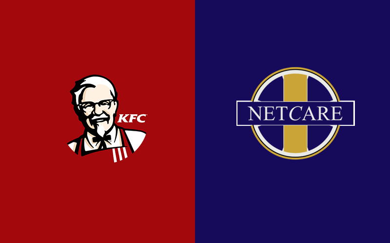
Psychologists have noticed some reliable patterns which we’ve all become partly familiar with thanks to fast food design and advertising:
• Reds and Yellows (long‑wave): Tend to boost arousal, making us feel energized or alert.
• Blues and Greens (short‑ to mid‑wave): Often linked to valence, nudging our mood toward calm, contentment, or even melancholy.
So, while that blazing red sale banner or your favourite fast food sign appears in the distance fires you up, a serene blue background might soothe your racing thoughts as you pull into a hospital. Coming back to our opening question, recent research also indicates prolonged exposure to blue light from screens impacts our sleep rhythm by disrupting our bodies ability to trigger certain sleep functions.
Colour: A Universal Language?
You might wonder: if we each build meaning around culture and experience, can colour ever be truly universal? A study spanning 30 countries uncovered 12 common colour‑emotion groupings, with surprisingly few disagreements. One quirk: only Greek participants linked purple with sadness.

Common Colour-Emotion Associations
Overall, these shared patterns suggest a broad, cross‑cultural “vocabulary” of colour associations; though it’s never a rigid grammar. Consistency in associations lends predictability, but individual and cultural nuances still dance around the edges. In practice, colour gives us a powerful toolkit: a shared foundation on which to layer context, creativity, and personal meaning. Some of the groupings are depicted in an adaption below.

Colour is more than just a decorative element, particularly in retail, where it’s a strategic tool that can shape how people feel and move. When masterfully executed, colour can make a centre more navigable, desirable and commercially effective.
Pine Crest: From Boring to Bold
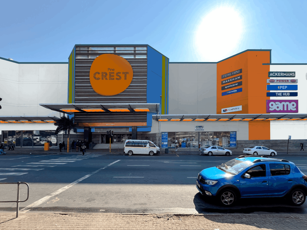
A successful paint refurbishment goes beyond the selection of the right shade, it creates a finish that enhances your building and reinforces its positioning. Our colour consulting guides you through this process from the very first site visit through to project completion to give you clarity and confidence at every stage. We ensured Pine Crest’s final result not only looks exceptional but also delivers long term value, through our process:
- Site & Context Evaluation
– We performed an on-site visit to assess Pine Crest’s façades, and surrounding buildings. Contextual assessment ensures the new scheme fits the precinct and avoids clashes.
- Brand-Aligned Colour Translation
– Aligning with the existing interior colour scheme, a palette of 6 colours was selected to reinforce Pine Crest’s vibrant new identity, offering a range that incorporates neutral, cool and warm hues. Overall, the palette leans toward a calm colour harmony with bold accents. Slight adaptations were made to address formulation requirements for the pigment and support the longevity of the colour. The light quality of the geographic area and the local demographic characteristics also influence the colour selection; due to their impact on the overall colour perception.

- Approval Presentation
– Vukile received rendered elevations, mood boards, sample references; as a clear visual of the vision. Our photorealistic visualizations enable faster stakeholder alignment and confident decisions, reducing back-and-forth.
- Technical Documentation
– A visualization report is compiled to indicate the intended usage of colours. These photos make it easier for a contractor to interpret correctly what’s required. We found this to be the most cost effective method to communicate with the project team and contractors.
- Remote Contractor Assistance
– Maintenance-driven projects rarely call for a full-time architect, yet they still benefit from professional oversight. Through remote contractor assistance, we’re able to guide the renovation with precision and keep the design vision intact. Challenges on site are resolved quickly, timelines stay on track, and the chosen colours are applied as intended; ensuring the building delivers the impact originally envisioned.
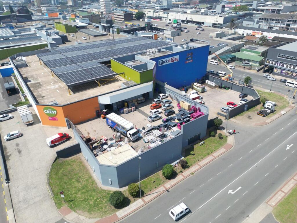

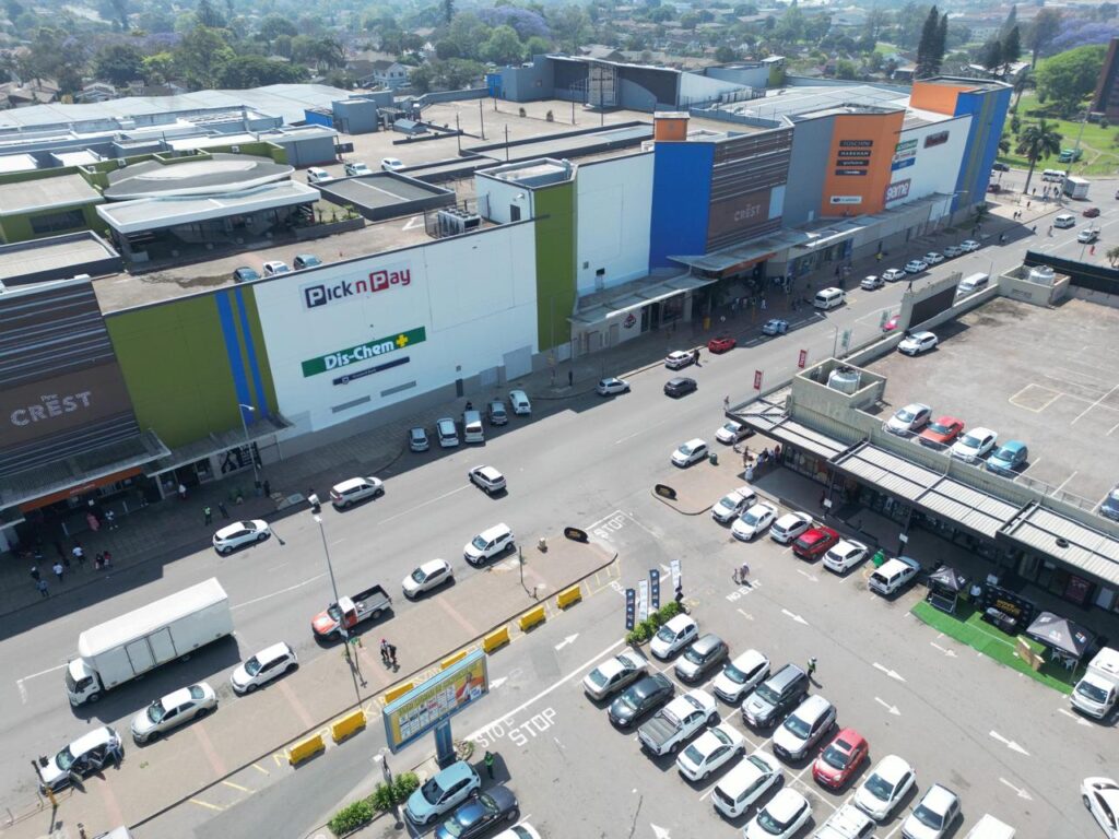
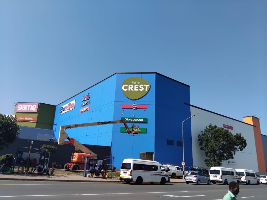
Updating Pine Crest center’s paint scheme was a cost-effective way to boost curb appeal and foot traffic. As we’ve established colour plays a pivotal role in perception and communication, in retail they can reinforce the brand identity and its perception to consumers. Let’s pick your next colour together and get your property noticed.
References:
Andrew J. Elliot (2015) Color and psychological functioning: a review of theoretical and empirical work.
Source link: https://www.frontiersin.org/journals/psychology/articles/10.3389/fpsyg.2015.00368/full
Christine Mohr, Ph.D., and Domicele Jonauskaite, Ph.D. (2025) Consistent Color-Emotion Correspondences Across 128 Years
Christine Mohr, Ph.D., and Domicele Jonauskaite, Ph.D. (2022) Why Links Between Colors and Emotions May Be Universal
Domicele Jonauskaite et al (2020) Universal Patterns in Color-Emotion Associations Are Further Shaped by Linguistic and Geographic Proximity
Source link: https://journals.sagepub.com/doi/10.1177/0956797620948810
Domicele Jonauskaite et al (2023) A comparative analysis of colour–emotion associations in 16–88-year-old adults from 31 countries
Source link: https://bpspsychub.onlinelibrary.wiley.com/doi/full/10.1111/bjop.12687?saml_referrer=
Behavioral Design Academy (2025) Color Psychology
Source link: https://www.behavioraldesign.academy/color-psychology/colors-and-emotions
Isabella S Bower et al (2022) Built environment color modulates autonomic and EEG indices of emotional response
Source link: https://pmc.ncbi.nlm.nih.gov/articles/PMC9786701/
Daivata Patil (2012) Coloring consumer`s psychology using different shades the role of perception of colors by consumers in consumer decision making process: a micro study of select departmental stores in Mumbai
Source link: https://jbrmr.com/cdn/article_file/i-16_c-135.pdf